CISCO
UX update for Webex Connect Page
Webex Connect is the main product of Webex CPaaS. The product is a programmable cloud communications platform, a quite complicated and hard to understand cloud software as a service that elevates the communication between enterprises and their customers. The re-designed UX tried to simplify the language and visuals in order to increase conversions.


Challenge
During the analysis of the page’s performance, we identified several pain points for visitors. Firstly, the representation of the product was overly complex; the UI images were too detailed and difficult to read. Additionally, we observed that users abandoned scrolling about halfway through the page, with the engagement rate hovering around 60%. Finally, the page lacked SEO was outdated, resulting in a low position on the SERPs.
Solution
We addressed these challenges by designing new user journeys for key personas, promoting conversions through demo forms and sandbox trials. We created new wireframes and components that encouraged deeper scrolling without making the page feel long, incorporating high-quality SVGs and more user-friendly product imagery. Additionally, we revised the copy to target relevant short and long-tail keywords, and resolved CLS and technical performance issues, all of which improved the page’s ranking on Google.
The result
After four months of intensive design, development, and review cycles, we successfully launched the new page just in time for the inaugural Gartner CPaaS Magic Quadrant evaluation. This was a critical milestone, as our site and page were to be reviewed by analysts and considered for placement in the Magic Quadrant.
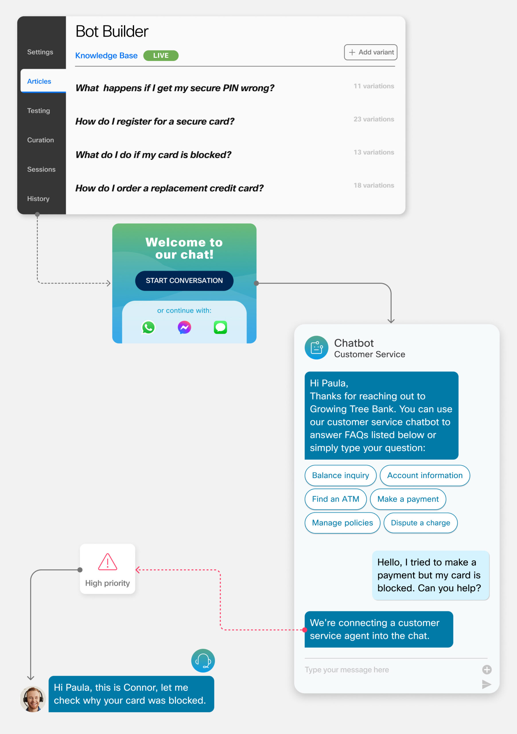
In addition to a comprehensive rewrite of the copy and the creation of new wireframes and customer journeys, the redesigned page introduced two entirely new components to its CMS library. These components were pivotal in narrating the product’s story and enabling users to easily access content relevant to their needs. The combined effect of these enhancements resulted in a significantly improved user experience and a more effective presentation of our product’s value.
Engagement rate
The page saw a 12% increase in engagement rate compared to pre-optimization numbers. Heatmap analysis confirmed deeper scrolling and higher interaction with the content, indicating that users were more engaged and finding the information more relevant and accessible.
Increase in organic traffic
By implementing a revised keyword and content strategy along with improved technical SEO, the page’s ranking on the SERP saw substantial improvement. Consequently, incoming traffic from organic search increased significantly, with page views rising to 5.1k compared to 2.9k previously.
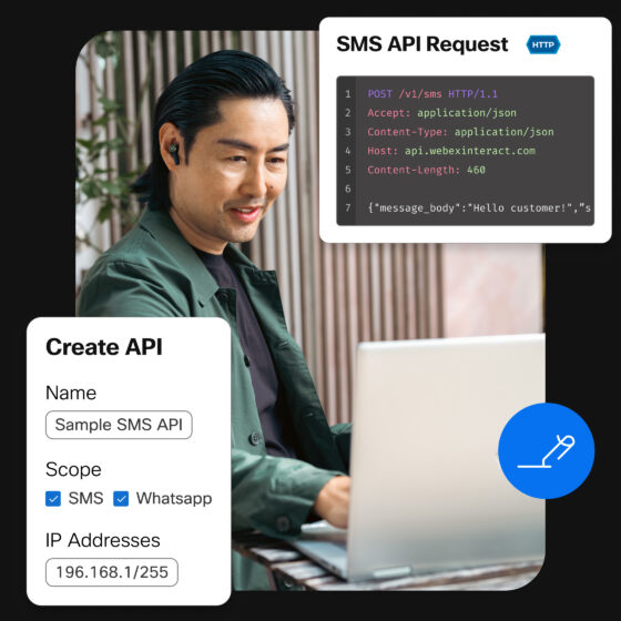
A new era for visual language
This page marked the inception of a new style of imagery to depict our product. We transitioned from using literal, small, and complicated screenshots to a blended style where key features of the product were highlighted alongside references to the customer experience. This approach made it easier to understand how each feature works and its significance.
The new creative direction, quickly gained traction across all departments. The blended style imagery became a standard, influencing all creative outputs produced by the team. This new visual approach was swiftly adopted in various formats including social media, advertising, PowerPoint presentations, PDFs, and even video content.